 English
Introduction
If you haven't followed the previous parts, here are the links:
In the previous parts, we added the state to our application. We also added a reducer which allows us, through actions, to create new objects rather than directly applying mutations to the old object. Thanks to this state, we were able to dynamically add columns and tasks.
In this part, we will add the ability to do drag and drop on columns and tasks. We will need to create the necessary animation to make this feature smooth, add the actions, and integrate react-dnd.
Drag column
To allow updating the position of the columns in the state, we need to add a new action. To do this, we need to go to the app-state-action.tsx file:
   | {
      type: "MOVE_LIST";
      payload: {
        dragIndex: number;
        hoverIndex: number;
      };
    }
In this action, we have several elements:
dragIndex: We use the original position of the column and pass it to ourdragIndexvariable.hoverIndex: When we hover over another column, we take its position and assign it tohoverIndex.- Before continuing and adding these actions to our reducer, we need to create three functions in our array utility:
moveItem: This function will allow us to change the index of an element in the array.removeItemAtIndex: This function will allow us to remove an element at a given index in the array.insertItemAtIndex: This function will allow us to add an element to the array at a given index.
 export const moveItem = <T>(array: T[], from: number, to: number) => {
  const item = array[from];
  return insertItemAtIndex(removeItemAtIndex(array, from), item, to);
};

export function removeItemAtIndex<T>(array: T[], index: number) {
  return [...array.slice(0, index), ...array.slice(index + 1)];
}

export function insertItemAtIndex<T>(array: T[], item: T, index: number) {
  return [...array.slice(0, index), item, ...array.slice(index)];
}
The set of actions is generically typed, which gives us flexibility. We move the elements without modifying the original array by using the removeItemAtIndex action to remove indices and the insertItemAtIndex action to add elements to arrays.
Now, we can add this action to AppStateReducer:
 case "MOVE_LIST": {
    const {
        dragIndex,
        hoverIndex
    } = action.payload;
    return {
        ...state,
        lists: moveItem(state.lists, dragIndex, hoverIndex),
    };
}
The next step is to add the react-dnd library, which will allow us to implement our drag-and-drop functionality. It includes many adapters that support various APIs, such as HTML5.
npm i react-dnd react-dnd-html5-backend
Once the installation is complete, we can add this library directly from our CDN:
 import React from "react";
import ReactDOM from "react-dom";
import "./index.css";
import App from "./app";
import reportWebVitals from "./reportWebVitals";
import { DndProvider } from "react-dnd";
import { HTML5Backend as Backend } from "react-dnd-html5-backend";
import { AppStateProvider } from "./states/app-state-provider";

ReactDOM.render(
  <DndProvider backend={Backend}>
    <AppStateProvider>
      <App />
    </AppStateProvider>
  </DndProvider>,
  document.getElementById("root")
);
We have added a drag-and-drop context to our application. This will allow us to use the useDrag and useDrop hooks in all of our components. Now, we need to create our ColumnDragItem type, which includes the following fields:
index: the index of the columnid: the ID generated earliertext: the text generated for the columntype: here, it will be hard-coded to say "COLUMN"
This type can be added in a folder named models (like most of the previously created types if you think you'll use them multiple times):
 export type ColumnDragItem = {
  index: number;
  id: string;
  text: string;
  type: "COLUMN";
};
export type DragItem = ColumnDragItem;
One limitation of react-dnd hooks is that we only have access to the element that is currently being used. The problem is the following: when we drag and drop, we have a preview of the item we started to move, but if we don't hide the original component (the starting state), it will feel like we're creating a duplicate rather than a true movement.
To solve this problem, we need to hide the original element. Therefore, we will create a new type in our project: AppState.
 export interface AppState {
  lists: Column[];
  draggedItem: DragItem | undefined;
}
Let's update appData:
 export const appData: AppState = {
  draggedItem: undefined,
  lists: [
    {
      id: "0",
      text: "To Do",
      tasks: [{ id: "c0", text: "Generate app scaffold" }],
    },
    {
      id: "1",
      text: "In Progress",
      tasks: [{ id: "c2", text: "Learn Typescript" }],
    },
    {
      id: "2",
      text: "Done",
      tasks: [{ id: "c3", text: "Begin to use static typing" }],
    },
  ],
};
We have two things left to do:
- Add the
SET_DRAGGED_ITEMaction: which will have apayloadincluding our previously defined model. - Implement this action in our reducer.
In app-state-action:
 import { DragItem } from "../models/drag-item";

export type Action =
  | {
      type: "ADD_LIST";
      payload: string;
    }
  | {
      type: "ADD_TASK";
      payload: { text: string; listId: string };
    }
  | {
      type: "MOVE_LIST";
      payload: {
        dragIndex: number;
        hoverIndex: number;
      };
    }
  | {
      type: "SET_DRAGGED_ITEM";
      payload: DragItem | undefined;
    };
Implementation in our app-state-reducer:
 case "SET_DRAGGED_ITEM": {
    return {
        ...state,
        draggedItem: action.payload
    };
}
We can create a hook that returns the drag method which accepts a reference to a draggable element. This hook will trigger the SET_DRAGGED_ITEM action to save the item in the state. When we finish the action, it will trigger the action again but with undefined as the payload.
Let's create a folder named dispatchers and add the use-item-drag.ts file:
 import { useDrag } from "react-dnd";
import { DragItem } from "../models/drag-item";
import { useAppState } from "../states/app-state-context";

export const useItemDrag = (item: DragItem) => {
  const { dispatch } = useAppState();
  const [, drag] = useDrag({
    item,
    begin: () =>
      dispatch({
        type: "SET_DRAGGED_ITEM",
        payload: item,
      }),
    end: () => dispatch({ type: "SET_DRAGGED_ITEM", payload: undefined }),
  });
  return { drag };
};
We will add the drag option to our column component:
 import React, { useRef } from "react";
import { ColumnContainer } from "../styled-components/container";
import { ColumnTitle } from "../styled-components/title";
import { AddNewItem } from "./add-new-item";
import { useAppState } from "../states/app-state-context";
import { Card } from "../components/card";
import { useItemDrag } from "../dispatchers/use-item-drag";

interface ColumnProps {
  text: string;
  index: number;
  id: string;
}

export const Column = ({ text, index, id }: ColumnProps) => {
  const { state, dispatch } = useAppState();
  const ref = useRef<HTMLDivElement>(null);
  const { drag } = useItemDrag({ type: "COLUMN", id, index, text });
  drag(ref);
  return (
    <ColumnContainer ref={ref}>
      <ColumnTitle>{text}</ColumnTitle>
      {state.lists[index].tasks.map((task, i) => (
        <Card text={task.text} key={task.id} index={i} />
      ))}
      <AddNewItem
        toggleButtonText="+ Add another card"
        onAdd={(text) =>
          dispatch({ type: "ADD_TASK", payload: { text, listId: id } })
        }
        dark
      />
    </ColumnContainer>
  );
};
We can verify that the drag works:
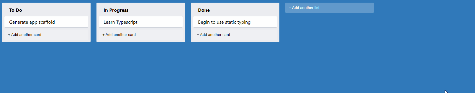
Here, we created a drag-and-drop that creates a ghost image of the column being moved. Additionally, we see that the original image remains in place and we can't drop our image.
Drop Column
As mentioned before, we can drag a column but not yet drop it. To find the place where we'll drop the column, we will use the other columns as targets. So, when we're not over a column, we will trigger the MOVE_LIST action to change the position of the column.
In our Column file, we can use useDrop from react-dnd. Let's create a new dispatcher called use-item-drop.ts:
 import { useDrop } from "react-dnd";
import { DragItem } from "…/models/drag-item";
import { useAppState } from "…/states/app-state-context";

export const useItemDrop = (index: number) => {
  const { dispatch } = useAppState();

  const [, drop] = useDrop({
    accept: "COLUMN",
    hover(item: DragItem) {
      const dragIndex = item.index;
      const hoverIndex = index;
      if (dragIndex === hoverIndex) {
        return;
      }
      dispatch({ type: "MOVE_LIST", payload: { dragIndex, hoverIndex } });
      item.index = hoverIndex;
    },
  });
  return { drop };
};
We will now update our item-column.ts:
 export const Column = ({ text, index, id }: ColumnProps) => {
  const { state, dispatch } = useAppState();
  const ref = useRef<HTMLDivElement>(null);
  const { drag } = useItemDrag({ type: "COLUMN", id, index, text });
  const { drop } = useItemDrop(index);
  drag(drop(ref));
Hide Column
We will now remove the column that is selected to get rid of this duplication effect. In our Container.tsx file, we will add DragPreviewContainer, which can be reused multiple times, but most importantly, we will style our container:
 interface DragPreviewContainerProps {
  isHidden?: boolean;
}

export const DragPreviewContainer = styled.div<DragPreviewContainerProps>`
  opacity: ${(props) => (props.isHidden ? 0.3 : 1)};
`;
We now need to calculate how to hide the columns. To do this, we'll add a new utility called is-hidden.ts:
 import { DragItem } from "../models/drag-item";

export const isHidden = (
  draggedItem: DragItem | undefined,
  itemType: string,
  id: string
): boolean => {
  return Boolean(
    draggedItem && draggedItem.type === itemType && draggedItem.id === id
  );
};
This function compares the type and ID of the currently selected item with the type and ID that we pass as an argument. We can now pass this utility in our Column.tsx component:
 export const Column = ({ text, index, id }: ColumnProps) => {
  const { state, dispatch } = useAppState();
  const ref = useRef<HTMLDivElement>(null);
  const { drag } = useItemDrag({ type: "COLUMN", id, index, text });
  const { drop } = useItemDrop(index);
  drag(drop(ref));
  return (
    <ColumnContainer
      ref={ref}
      isHidden={isHidden(state.draggedItem, "COLUMN", id)}
    >
      <ColumnTitle>{text}</ColumnTitle>
      {state.lists[index].tasks.map((task, i) => (
        <Card text={task.text} key={task.id} index={i} />
      ))}
      <AddNewItem
        toggleButtonText="+ Add another card"
        onAdd={(text) =>
          dispatch({ type: "ADD_TASK", payload: { text, listId: id } })
        }
        dark
      />
    </ColumnContainer>
  );
};
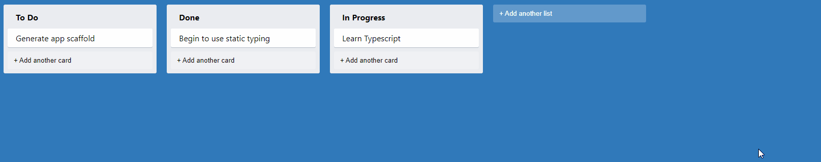
We should get the following result:
Effect during Drag and Drop
If we look closely, Trello uses a slightly tilted effect during drag and drop. The react-dnd library allows us to implement a customDragLayer, which allows us to customize the element we want to move. Let's add a new container in Container.tsx called CustomDragLayerContainer:
 export const CustomDragLayerContainer = styled.div`
  height: 100%;
  left: 0;
  pointer-events: none;
  position: fixed;
  top: 0;
  width: 100%;
  z-index: 100;
`;
We want this container to be on top of all others. That's why we use such a high index. Another important point: pointer-events: none, which allows us to ignore all mouse events. The next step is to create a layer, or component, that uses useDragLayer from react-dnd. Let's create a new component in our components folder:
 import { useDragLayer } from "react-dnd";
import { CustomDragLayerContainer } from "../styled-components/container";
import { Column } from "../components/column";

const CustomDragLayer: React.FC = () => {
  const { isDragging, item } = useDragLayer((monitor) => ({
    item: monitor.getItem(),
    isDragging: monitor.isDragging(),
  }));
  return isDragging ? (
    <CustomDragLayerContainer>
      <Column id={item.id} text={item.text} index={item.index} />
    </CustomDragLayerContainer>
  ) : null;
};
In our code, useDragLayer allows us to get isDragging, but also the element being dragged. We use a column to preview the movement, while passing the ID, index, and text of the item being moved.
Preview
We will create a function that will:
- Coordinate the moving item with
react-dnd - Generate styles with a
transformattribute to create the preview.
In our previously created component, we can create this function:
 import { XYCoord, useDragLayer } from "react-dnd";
import { CustomDragLayerContainer } from "../styled-components/container";
import { Column } from "../components/column";

function getItemStyles(currentOffset: XYCoord | null): React.CSSProperties {
  if (!currentOffset) {
    return {
      display: "none",
    };
  }
  const { x, y } = currentOffset;
  const transform = `translate(${x}px, ${y}px)`;
  return {
    transform,
    WebkitTransform: transform,
  };
}
The function takes a currentOffset parameter of type XYCoord, which will contain the position of the grabbed item. The positions of this item will allow us to create the CSS transform. This function should be added in a div element around our column that serves as a preview:
 const CustomDragLayer: React.FC = () => {
  const { isDragging, item, currentOffset } = useDragLayer((monitor) => ({
    item: monitor.getItem(),
    currentOffset: monitor.getSourceClientOffset(),
    isDragging: monitor.isDragging(),
  }));

  if (!isDragging) {
    return null;
  }

  return (
    <CustomDragLayerContainer>
      <div style={getItemStyles(currentOffset)}>
        <Column
          id={item.id}
          text={item.text}
          index={item.index}
          isPreview={true}
        />
      </div>
    </CustomDragLayerContainer>
  );
};
export default CustomDragLayer;
Now that our component is defined, we need to:
- Mount the component in our
App.
   return (
    <AppContainer>
      <CustomDragLayer />
      {state.lists.map((list, i) => (
        <Column id={list.id} text={list.text} key={list.id} index={i} />
      ))}
      <AddNewItem
        toggleButtonText="+ Add another list"
        onAdd={(text) => dispatch({ type: "ADD_LIST", payload: text })}
      />
    </AppContainer>
  );
- Hide the default preview using
useEffectinuse-item-drag.ts:
 import { useEffect } from "react";
import { useDrag } from "react-dnd";
import { DragItem } from "../models/drag-item";
import { useAppState } from "../states/app-state-context";
import { getEmptyImage } from "react-dnd-html5-backend";

export const useItemDrag = (item: DragItem) => {
  const { dispatch } = useAppState();
  const [, drag, preview] = useDrag({
    item,
    begin: () =>
      dispatch({
        type: "SET_DRAGGED_ITEM",
        payload: item,
      }),
    end: () => dispatch({ type: "SET_DRAGGED_ITEM", payload: undefined }),
  });
  useEffect(() => {
    preview(getEmptyImage(), { captureDraggingState: true });
  }, [preview]);
  return { drag };
};
We have successfully hidden the default preview using getEmptyImage. Our preview is hidden because we are using the same ID and index for our moving column. Therefore, we need to add isPreview as a condition to our isHidden function:
 import { DragItem } from "../models/drag-item";

export const isHidden = (
  isPreview: boolean | undefined,
  draggedItem: DragItem | undefined,
  itemType: string,
  id: string
): boolean => {
  return Boolean(
    !isPreview &&
      draggedItem &&
      draggedItem.type === itemType &&
      draggedItem.id === id
  );
};
Now we need to add this property to our ColumnProps interface and add the information in our Column component:
 interface ColumnProps {
  text: string;
  index: number;
  id: string;
  isPreview?: boolean;
}
export const Column = ({ text, index, id, isPreview }: ColumnProps) => {
  const { state, dispatch } = useAppState();
  const ref = useRef<HTMLDivElement>(null);
  const { drag } = useItemDrag({ type: "COLUMN", id, index, text });
  const { drop } = useItemDrop(index);
  drag(drop(ref));
  return (
    <ColumnContainer
      ref={ref}
      isHidden={isHidden(isPreview, state.draggedItem, "COLUMN", id)}
    >
We also need to change the opacity of our container while adding the isPreview property:
 interface DragPreviewContainerProps {
  isHidden?: boolean;
  isPreview?: boolean;
}

export const DragPreviewContainer = styled.div<DragPreviewContainerProps>`
  transform: ${(props) => (props.isPreview ? "rotate(5deg)" : undefined)};
  opacity: ${(props) => (props.isHidden ? 0 : 1)};
`;
If everything goes well, here is the result:

End of Part 3
We now have the ability to drag and drop our columns. In the next chapter, we will:
- Continue our drag and drop for our cards.
- Create cases to differentiate drag and drop for our cards and columns.
The continuation of this tutorial can be found here: React - Trello - Part 4.