Why use TypeScript?
This is a question that is often heard in the world of JS. I have personally adopted this solution for some time now. In React, an application is referred to as a tree of components:
- Each component represents an element: a button, a navigation bar...
- This element is then grouped: login form
- Components can transmit information from parent to child and vice versa
It is by knowing all of these elements that we can say that TypeScript is really useful:
- We can create interfaces for our components: we are then sure that our components receive the correct inputs.
There is "prop-types" which allows us in JS to define a type:
 import PropTypes from 'prop-types';
const Greeting = ({
    name
}) => {
    return ( <
        h1 > Hello, {
            name
        } < /h1>
    );
}
Greeting.propTypes = {
    name: PropTypes.string
};
But why not use this keyword?
This keyword will not be detected by your editor. In other words, you will only realize that the variable passed is not the right type when you launch the application. This keyword can only be used with components: in your application there will also be functions and classes that do not use React.
TypeScript is more powerful: it gives the ability to define types ourselves.
Our project for this lab?
We will reproduce the Trello site (simplified version): Trello. Trello allows us to have a kanban board where:
- We can create tasks
- Organize these tasks into lists
- We can drag and drop these tasks
- Add comments and add files to a task
Here we will cover functionalities: 1, 2 and 3. 4 will be ignored.
Result:
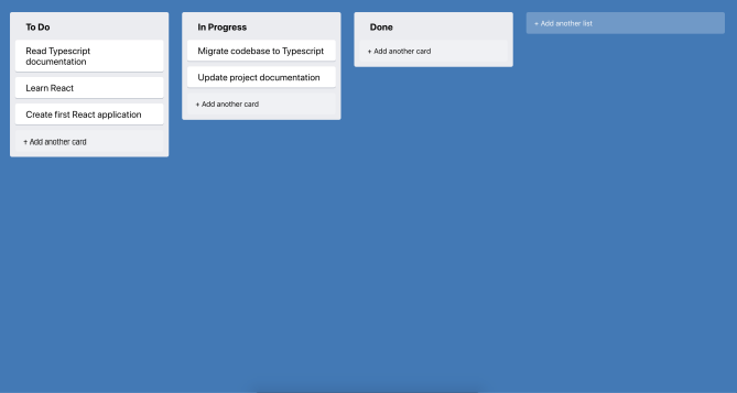
What we want:
- Display columns that can be dragged and dropped: each column is a list of tasks
- Each task must be draggable and move from column to column
- The ability to create new columns by clicking a button
- Each column must allow us to create a task
Project Creation:
We will create our project through the React CLI, but why use this CLI?
- It allows all dependencies to be brought with it
- It facilitates the tools for our program: Webpack or Parcel
- It provides us with runners: CSS, lint, hot-reload, ...
npx create-react-app --template typescript trello-clone
Project Creation:
We will create our project through the React CLI, but why use this CLI?
- It allows all dependencies to be brought with it
- It facilitates the tools for our program: Webpack or Parcel
- It provides us with runners: CSS, lint, hot-reload, ...
Structure
When generating the project, you should see the following structure:
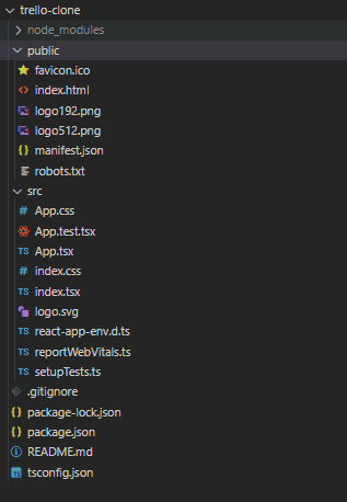
We will briefly explain these folders/files:
- readme: file that contains the description of your application for Git
- package.json: contains the project metadata: name, version, description. But also the dependencies of external libraries.
- public: folder that contains the static files of our application. They are not included in the compilation process and are untouched during the build.
- index.html: entry file that mounts the React application
- manifest.json: provides metadata for PWAs. For example: this file allows the installation of the application on a mobile phone, similar to a native application. It contains: the application name, the icon, the theme colors and other data for the mobile application.
- src: in this folder, files will be used by Webpack and added to the bundle.
- index.tsx: entry point of our application, Webpack will use it to build your application. It contains the React logic to render our application.
- reportWebVitals: allows us to measure the performance of our application.
- React.StrictMode: is a good practice and ensures that we are not using deprecated methods.
- app.tsx: represents the root of your application, it is the first instance mounted in the DOM that imports React by default.
- react-app-env.d.ts: it contains the definitions of types in TypeScript. We can reference image and other files there, otherwise TypeScript would not understand them (it is only interested in TS files).
JSX and TSX, what is it?
It is a syntactic extension of JavaScript used by React. This language allows us to no longer separate rendering from logic. In other words, you will no longer have separate HTML files from JS logic, but one file combining both.
 function formatName(user) {
  return user.firstName + ' ' + user.lastName;
}

const user = {
  firstName: 'Kylian',
  lastName: 'Mbappé'
};

const element = (
  <h1>
    Bonjour, {formatName(user)} !
  </h1>
);

ReactDOM.render(
  element,
  document.getElementById('root')
);
JSX is nothing more than an extension. After compilation, JSX expressions become simple JavaScript function calls, whose evaluation returns JavaScript objects.
Deleting files
Before going further, we can delete the files that we don't need:
- logo.svg
- App.css
- App.test.tsx
Style:
Now we will create a "styles" folder: this folder will group all of our CSS files. Usually, I like to use SASS, as it greatly simplifies the complexity that comes with the CSS language and uses a slightly more modern approach.
Let's create a "styles" folder in the "src" folder. Inside this folder, we can add a "style" folder.
 html {
    box-sizing: border-box;
}
*, *:before, *:after {
    box-sizing: inherit;
}

html, body, #root {height: 100%;}
To run this file, we need to install a dependency:
npm i sass
Thanks to this, we are able to install and interpret SASS files. Now, we can directly import this file in App.tsx:
 import React from 'react';
import "./styles/index.scss";

function App() {
That's a good thing done! But there is a really useful library that works very well with TypeScript: styled-components! In other words, this library allows us to create reusable components attached to a style. To install it:
 npm i styled-components
npm i @types/styled-components
We will create style files for the following components:
- AppContainer: will allow us to arrange the columns horizontally
- ColumnContainer: sets the gray background color and rounded corners
- ColumnTitle: sets the title in bold and adds spacing
- CardContainer
Let's create a "container.ts" file in the "styled-components" folder. This file will encompass all of the containers we defined earlier:
 import styled from "styled-components";

export const AppContainer = styled.div`
align-items: flex-start;
background-color: #3179ba;
display: flex;
flex-direction: row;
height: 100%;
padding: 20px;
width: 100%;`

export const ColumnContainer = styled.div`
background-color: #ebecf0;
width: 300px;
min-height: 40px;
margin-right: 20px;
border-radius: 3px;
padding: 8px 8px;
flex-grow: 0;~
`
export const CardContainer = styled.div`
background-color: #fff;
cursor: pointer;
margin-bottom: 0.5rem;
padding: 0.5rem 1rem;
max-width: 300px;
border-radius: 3px;
box-shadow: #091e4240 0px 1px 0px 0px;`
So we have defined our 3 components. All of these 3 components will be used to generate a div that has CSS applied to it. So, in our App file, we can add:
 import React from 'react';
import "./styles/index.scss";
import { AppContainer } from "./styled-components/container"

function App() {
  return (
    <div className="App">
      <AppContainer>
        Columns will go there
      </AppContainer>
    </div>
  );
}

export default App;
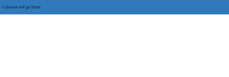
This will give us a blue container, displaying text where our columns will be placed:
We will apply the other styled-components later, but first, we can create a new file named "title.ts":
 import styled from "styled-components";

export const ColumnTitle = styled.div`
padding: 6px 16px 12px;
font-weight: bold;`
Perfect! Our styles are defined and we can now move on to the serious stuff: creating our columns!
Components:
We will use components, which will allow us to add logic to our code and add behavior for each of these components. We won't go into detail about how components work, but if you're interested in going deeper, you can check out the official React documentation.
When we define components in React, we need to give types to props (data passed from parent to child) and states (component data). First, we will create a "components" folder at the root of the "src" folder. This will allow us to have a folder that brings together all of our components. Then, we can create our first component: Column.tsx.
 import React from "react"
import {
    ColumnContainer
} from "../styled-components/container";
import {
    ColumnTitle
} from "../styled-components/title"

export const Column = () => {
    return ( <
        ColumnContainer >
        <
        ColumnTitle > Column Title < /ColumnTitle> <
        /ColumnContainer>
    )
}
Here, we reused our different styles previously created. Well, this code is not complete, we want to allow the parent to pass the values of the columns to the child! But in TypeScript, we have to type these props, otherwise it would be too easy:
 interface ColumnProps {
    text ? : string
}

export const Column = ({
    text
}: ColumnProps) => {
    return ( <
        ColumnContainer >
        <
        ColumnTitle > Column Title < /ColumnTitle> <
        /ColumnContainer>
    )
}
Wait a minute?! Why does "text?: string" have a question mark? Simply because this little trick tells TypeScript that a value is not required. In other words: we will have an "undefined" if it is not passed.
Next, let's create our card by adding, and I'm sure you guessed it, a "card.tsx" file in our "components" folder:
 import React from "react"
import {
    CardContainer
} from "../styled-components/container"

interface CardProps {
    text: string
}

export const Card = ({
    text
}: CardProps) => {
    return <CardContainer > {
        text
    } < /CardContainer>
}
Nothing too complicated compared to what we did earlier, except that here we define the "text" prop as mandatory!
Now we can add this card to our "Column" component:
 import React from "react";
import { ColumnContainer } from "../styled-components/container";
import { ColumnTitle } from "../styled-components/title";

interface ColumnProps {
  text?: string;
}

export const Column = ({
  text,
  children,
}: React.PropsWithChildren<ColumnProps>) => {
  return (
    <ColumnContainer>
      <ColumnTitle>{text}</ColumnTitle>
      {children}
    </ColumnContainer>
  );
};
React.PropsWithChildren: improves our props interface by adding a definition for children. We could have also added it directly in our interface; children?: React.ReactNode. But our approach is cleaner and allows us to use the functions provided by React.
Now, we will put everything together in our App.tsx:
 import React from "react";
import "./styles/index.scss";
import { AppContainer } from "./styled-components/container";
import { Card } from "./components/card";
import { Column } from "./components/column";

const App = () => {
  return (
    <AppContainer>
      <Column text="To Do">
        <Card text="Generate app scaffold" />
      </Column>
      <Column text="In Progress">
        <Card text="Learn Typescript" />
      </Column>
      <Column text="Done">
        <Card text="Begin to use static typing" />
      </Column>
    </AppContainer>
  );
};

export default App;
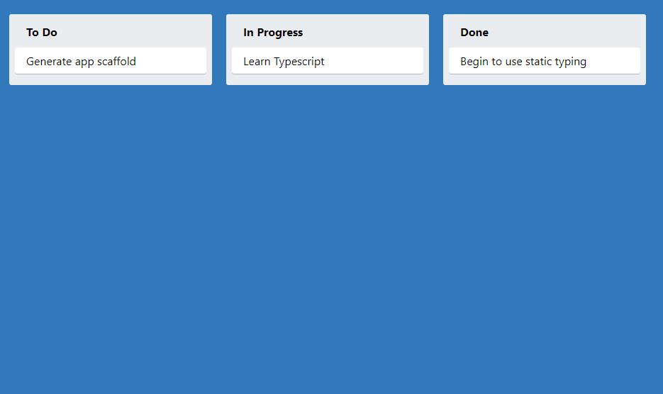
We've done some good work, I think:
Interactions:
So far we don't have any logic, so let's add the following logic:

We have two states:
- A button that adds another task
- A button that adds another list
When we click on the button, the components provide us with an input field and another "Create" button. Clicking on this button will call the callback function that we will pass to it via a prop.
 import styled from "styled-components";

interface AddItemButtonProps {
    dark?: boolean;
}

export const AddItemButton = styled.button<AddItemButtonProps>`
background-color: #ffffff3d;
border-radius: 3px;
border: none;
color: ${props => (props.dark ? "#000" : "#fff")};
cursor: pointer;
max-width: 300px;
padding: 10px 12px;
text-align: left;
transition: background 85ms ease-in;
width: 100%;
&:hover {
background-color: #ffffff52;
}
`
Here, nothing too complicated, the only thing that differs from everything we've done previously:
- We use a prop to define the button text color.
This button will be used throughout our application to define the various buttons listed above. Now we can create our add form. For that, nothing magical again, we will start by creating the container for our form in the styled-components/container.ts file:
 export const NewItemFormContainer = styled.div`
max-width: 300px;
display: flex;
flex-direction: column;
width: 100%;
align-items: flex-start;
`
Next, we can create our button by adding the following style in our styled-components/button.ts file:
 export const NewItemButton = styled.button`
background-color: #5aac44;
border-radius: 3px;
border: none;
box-shadow: none;
color: #fff;
padding: 6px 12px;
text-align: center;
`
This component gives us a beautiful green button with very nice borders! Well now I propose to create a new file in our styled-components: form.ts. In this folder, we will add all the elements specific to forms. Let's start with our input:
 import styled from "styled-components";

export const NewItemInput = styled.input`
border-radius: 3px;
border: none;
box-shadow: #091e4240 0px 1px 0px 0px;
margin-bottom: 0.5rem;
padding: 0.5rem 1rem;
width: 100%;
`
We have everything to create our component now, so let's create the add-new-item.tsx file in the component folder:
 import React, { useState} from "react"
import { AddItemButton } from "../styled-components/button"

interface AddNewItemProps {
    onAdd(text: string): void
    toggleButtonText: string;
    dark?: boolean;
}
So far, nothing complicated, the idea is that the possible props are:
- onAdd: This is a callback function that we call when we click on the button.
- toggleButtonText: This is the text we want to display in the button component.
- dark: Represents the property we pass to the component.
We can add the logic of our add:
 export const AddNewItem = (props: AddNewItemProps) => {
    const [showForm, setShowForm] = useState(false);
    const { onAdd, toggleButtonText, dark } = props;
    if (showForm) {
        // We show item creation form here
    }
    return (
        <AddItemButton dark={dark} onClick={() => setShowForm(true)}>
            {toggleButtonText}
        </AddItemButton>
    )
}
We have defined our states:
- showForm: to show or hide the "Create" button
- setShowForm: to modify the showForm property (setter)
We have also explained our props above. Then we return the component, which has a callback function that will change the state. In short, our component is almost finished, but we are missing the form that we will place in our IF. Let's create the new-item-form.tsx component in our components folder:
 import React, { useState } from "react";
import { NewItemButton } from "../styled-components/button";
import { NewItemFormContainer } from "../styled-components/container";
import { NewItemInput } from "../styled-components/form";
We have imported our previously defined styled-components. Now let's add the props, we need to add our onAdd function:
 interface NewItemFormProps {
    onAdd(text: string): void
}
We can add the body of our component that will assemble all of our styled-components:
 import React, { useState } from "react";
import { NewItemButton } from "../styled-components/button";
import { NewItemFormContainer } from "../styled-components/container";
import { NewItemInput } from "../styled-components/form";

interface NewItemFormProps {
  onAdd(text: string): void;
}

export const NewItemForm = ({ onAdd }: NewItemFormProps) => {
  const [text, setText] = useState("");
  return (
    <NewItemFormContainer>
      <NewItemInput value={text} onChange={(e) => setText(e.target.value)} />
      <NewItemButton onClick={() => onAdd(text)}>Create</NewItemButton>
    </NewItemFormContainer>
  );
};
This component is used to save the value of the text field. One notable thing is the omission of typing for the event in our onChange callback function. This is made possible by React which provides the type to Typescript.
Now we need to import our component in AddNewItem to display the form when the "Add" button is clicked:
 import React, { useState } from "react";
import { AddItemButton } from "../styled-components/button";
import { NewItemForm } from "./new-item-form";

interface AddNewItemProps {
  onAdd(text: string): void;
  toggleButtonText: string;
  dark?: boolean;
}

export const AddNewItem = (props: AddNewItemProps) => {
  const [showForm, setShowForm] = useState(false);
  const { onAdd, toggleButtonText, dark } = props;
  if (showForm) {
    return (
      <NewItemForm
        onAdd={(text) => {
          onAdd(text);
          setShowForm(false);
        }}
      />
    );
  }
  return (
    <AddItemButton dark={dark} onClick={() => setShowForm(true)}>
      {toggleButtonText}
    </AddItemButton>
  );
};
We have imported our component. We have added this component in our showForm condition. The component will use the setShowForm function to close itself.
End of Part 1
Well, we have created all the components and actions we want. In the next chapter, we will:
- Assemble the components in the application layout
- Add the notion of state
- Use and create a Reducer to manipulate the state
- Create actions
The next part of this tutorial can be found here: React - Trello - Part 2

 English
